
Showing posts with label Website. Show all posts
Showing posts with label Website. Show all posts
Thursday, 27 March 2014

Thursday, 20 February 2014
More Website Research


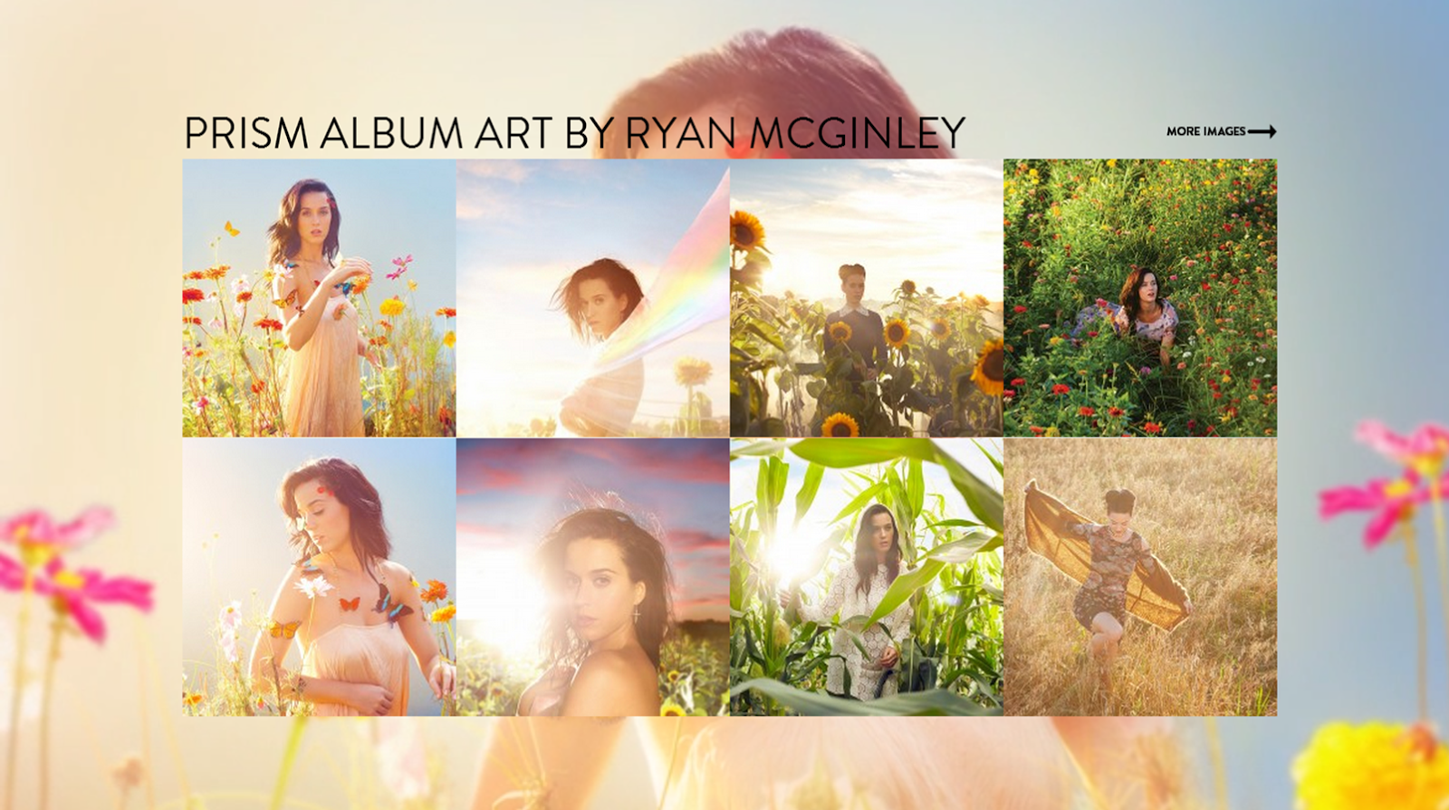


I love using Katy Perry as an example as she is the exact replica we want to convey of our own artist Xena. She represents Pop music as she is seen as such an inspiration in the music industry, therefore her website is very valuable to my research. I will start off my saying that the most surprising feature of her website which I noticed straight away was the layout; there was no menu bar but instead a long page of information. Again like the previous website I looked at it doesn't talk much about the artist on a personal level, although when it comes to my own website I think it is important to add a Bio of information. Moving on, one thing that pops out at me is the '#DARKHORSEVIDEO' which obviously means a new music video, it is a good idea to use terminology that applies to her target audience; young adult and even older as Twitter becomes more popular in popular culture. I like the range of images that they use; hints of innocence and adventure which makes her more appealing. Furthermore the use of different fonts and colours work well together on this particular occassion although I do believe that as she is such a strong generic artist who is known to wear crazy outfits; the colour scheme and imagery could be more creative. I also like the how the background images move as you scroll; its modern and creates a 3D motion which is interesting. On an informative basis, it provides details into upcoming events including an attractive map. It also provides videos of her most reason music video and also images of innovative album art designs.
Tuesday, 18 February 2014
Website research

* Main image of artist and multiple other images
* Chosen colours are pink and black, the pink attracts the female audience and the black is used to make it look stylish and professional
* The same font is used through which makes it consistent
* Lots of pictures and videos
* No blank spaces making it packed with detail
* Includes videos of her music videos
* Has links to her instagram (Social media) which makes us feel closer to the artist
* Includes a video diary, sharing things with her fans behind the scenes
* Includes latest twitter news from her own account

* Uses large three dimensional image of artist
* Includes links to external events Iggy has been in, keeping fans in the loop
* Has a Social media bar including Twitter, Facebook, Soundcloud and Youtube
* Keeps fans up to date with an Archive of past and upcoming events and links to buy her new album on Itunes

* Includes all her old and new music videos
* Made in a modern gallery of videos
* Little spacing, but compact
* Clear and simple layout

* Background image is a slideshow of images
* This page has singles and albums with the list of songs and release date
* Links to itunes
* Consistent colour theme of black and pink

* Black and white background is sleek and professional but still shows personality
* Items includes a poster, tops and a beanie
* Merchandise contains prints of her favourite slogan printed on top and images of her self
* Includes a shopping cart, social media, layout options, a help buttons and the chance to set up your own account
* It opens in a separate tab

* Black background so the main news feed stands out
* Consistent colouring and fonts
* Includes upcoming events and and Archive, dates, locations and links to purchase tickets
* Simple but gets to the point
Overall
I like the use of using two consistent colours that work well together and also represent the artist, I also like the use of visuals and how they are compact and clear. I particularly like the background image being Iggy as it reminds you that she is part of the website and I preferred that to other random imaging, although the slideshow of images was very exciting. If i was to improve this website i would include more writing, maybe a bio about the artist or a personal message from the artist as it is quite formal.
Monday, 17 February 2014
Starting my website
My Website
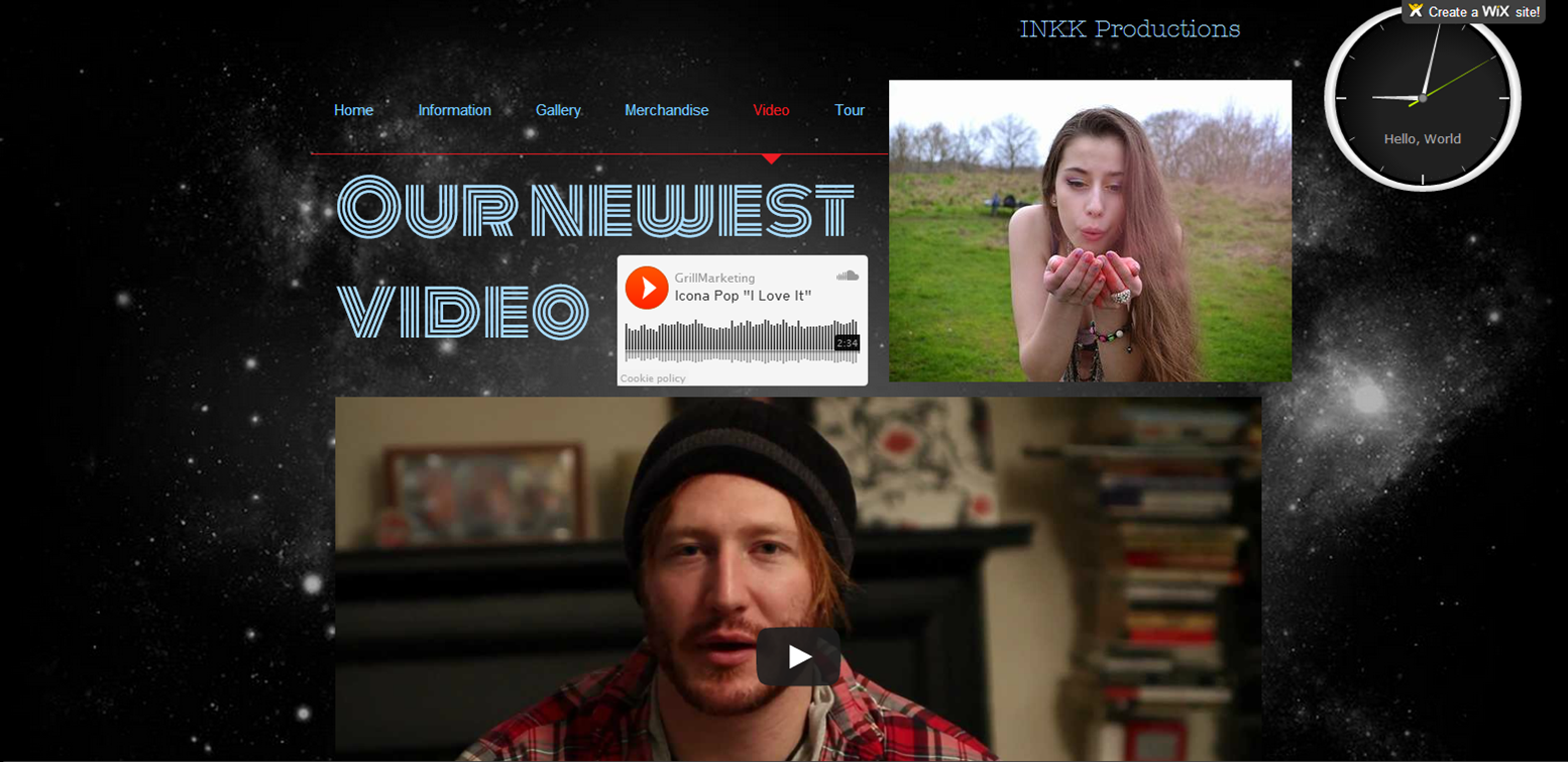
I have found it very hard to make my website, however the design was quite easy to create as I felt that the themes I was going for would be space-like, mystical and modern. Using a black and white background would be a good basis for lots of colour. The image on my homepage is favourable to me as it sets a simple but effective, and the use of colourful links and pictures popped out the page. I created an Instagram account called 'XenaMelody' and a twitter account '@XenaMelody'. I am finding it difficult to make my online store as the software is quite complex to me, apart from this my website is going quite well.




Subscribe to:
Posts (Atom)